

Jeffrey A. Shaffer, Chief Operating Officer and Vice President of Information Technology and Analytics at Unifund and Recovery Decision Science. Mr. Shaffer is also Adjunct Professor at the University of Cincinnati in the Carl H. Lindner College of Business teaching Data Visualization where he was awarded the 2016 Adjunct Faculty of the Year Award for Operations, Business Analytics and Information Systems. He is a regular speaker at conferences, symposiums, universities and corporate training programs on the topic of data visualization, data mining and Tableau. Mr. Shaffer has taught data visualization at the KPMG Advisory University, KPMG Global Analytics and for the University of Cincinnati Center for Business Analytics.
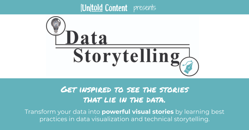
This episode is powered by data storytelling training from Untold Content and Data+Science. Transform your data into powerful visual stories by learning best practices in data visualization and technical storytelling. Whether you’re a PowerBI or a Tableau person—or just want to better communicate your data—this workshop will inspire you to see the stories that lie in the data. Learn more at untoldcontent.com/data-storytelling-training.
Katie [00:00:04] Welcome to Untold Stories of Innovation, where we amplify untold stories of insight, impact and innovation. Powered by untold content. I’m your host, Katie Trauth Taylor. Our guest today is Jeff Shaffer. He is COO and V.P. of Unifund and he’s the founder of dataplusscience.com. Jeff is also an adjunct professor at the University of Cincinnati, a Tableau Zen Master, and coauthor of a giant book on data visualization called The Big Book of Dashboards: Visualizing Your Data Using Real-World Business Scenarios. Jeff, thank you so much for being on the podcast today.
Jeff [00:00:45] Thank you for having me.
Katie [00:00:47] I’ve had the pleasure of getting to co-present with you. We actually developed a workshop together on data storytelling. And so I’m excited to share some of the insights we uncovered through our process of creating that workshop together today.
Jeff [00:01:01] Yeah, that was a lot of fun. I’m excited to talk about that.
Katie [00:01:03] But tell us first a little bit about what data storytelling is and how dashboards play an important role in that.
Jeff [00:01:13] Yeah. You know, data storytelling is kind of a broad term and people—it’s going to become a buzzword in the data visualization community, probably in part because of an author Cole Kanflic, Cole Nussbaumer Knaflic, has a great book called Storytelling with Data and that probably set off the term. Her website is even storytellingwithdata.com. So I think that’s probably in the last five years, you know, sort of a developing thing that sort of happened with a lot of people talking about how stories play a part in data itself. That’s been a controversial term, I guess a little bit as well, because, you know, stories—if you think about, you know, a technical definition of a story, you know, it has characters or it has a plot or it has a storyline and oftentimes data or a dashboard specifically does not do that. But then other people use the term more in a broader sense. And so it’s kind of, you know, maybe opening a can of worms, if you will. But I can at least give you my take on it, I guess. From a broader standpoint, I’d say dashboards specifically help us find where the stories might be in the data. Not necessarily have to tell the story itself. You might be monitoring conditions of something. You might be looking at a process or something in your organization and you might use that dashboard on a daily basis. And that might give you an indication that something’s gone wrong. Where to go look. You know, you see smoke, but is it a fire? And so that’s where I kind of see, you know, data storytelling comes into play in a number of areas. But as it relates to dashboards, dashboards may be one of the tools to help you find the stories that you bring out in your data.
Katie [00:03:10] Definitely. And most organizations are using dashboards to analyze and visualize data points that are massive and trying to really be able to see that data in a way that helps them take some sort of action or, like you mentioned, know to prevent a fire or check in on a problem. And one of the—one of the really interesting things about our work together is, I think, our way of combining the concept that data in itself, you know, I think there’s this assumption, right, that data is pure or that numbers never tell stories. But as you advance in your understanding of data and what to do with data and what actions we take as a result of data, it’s clear that storytelling is integral to data visualization. It’s really part and parcel of coming up with the ways that we can sort of find logic or find patterns and take action from data.
Jeff [00:04:17] I think that’s right. And I would add to that, you know, in the way we intersected together, you and I, on our work with that particular workshop, I think what—we kind of discovered some of those things right. In my teaching I usually talk about data is just really in a raw form, you know, a database, a sequel server, your Excel spreadsheet or tab delimited file or something. And in and of itself that it doesn’t do anything. It just kind of sits right. And then you want to get information out of that data. So you look at it, you aggregate it, you filter it, you sort of dive into it to find those things about it. And ultimately, that information should lead to knowledge that you get out of that data. So, you know, I talk about the continuum of data to information, information to knowledge in the knowledge section. You really need the what I call the SMB, the subject matter expert, to really help you find the learnings of what you’re getting from that information in the data. And in the workshop, you know, in our particular case, we were working with a major hospital. And, you know, I’m not a healthcare expert by any means. I’m not a doctor. I have done some consulting in that field, but I don’t know a lot about that data specifically. Right. And so you really have to work together as a group to kind of figure out what that is. I can build a dashboard for somebody that would give them an indication of maybe something gone wrong, but then what? Right. What’s the next step? And so I think that’s the intersection for me is where data storytelling, in a variety of forms. In our particular client, you know, that we were talking to, they had one group that might’ve wanted to hand something out as a sort of a pamphlet. And another instance it might be something they want to add to their website. And then in another group, they were really looking for something that internally they could monitor sort of as a dashboard. And when we think about data storytelling, that’s really different in each one of those categories. Right. It might be a different end product. It might be a different way, a method, of telling the story completely.
Katie [00:06:32] Yes. And so a critical element of data storytelling and the way that that term, I think, is a little bit different from just data collection or data reporting is that you’re thinking really critically about the audiences that are receiving that information and how they make knowledge from it. And so quite a bit of what we do together in our data storytelling workshop is—Jeff, you do a brilliant job of covering the best practices in data visualization, the different types of data visuals that you can make. And then we build on that information and we talk more about persona and audience and how to map data points and data needs to the different audiences you’re trying to reach with that information. And we talk about what best practices exist for being able to build context for the data. So that means the words that surround your data visualizations or your data. And it also means the way that you presented or what data points you choose to share. And really trying to map—we do this exercise or recreate this giant whiteboard exercise chart where we’re mapping the different personas and audiences that that organization is trying to reach with their data to the different data points. We prioritize those data points. We think through what visual metaphors will be helpful, especially pulling on those best practices and data visualization. And then we think about the target medium and sometimes that’s a dashboard like you mentioned, and sometimes that’s an infographic or a handout. So it’s really this beautiful way of being sure that when we’re thinking about data, we’re not ignoring the fact that we are humans who need to act as a result of seeing data.
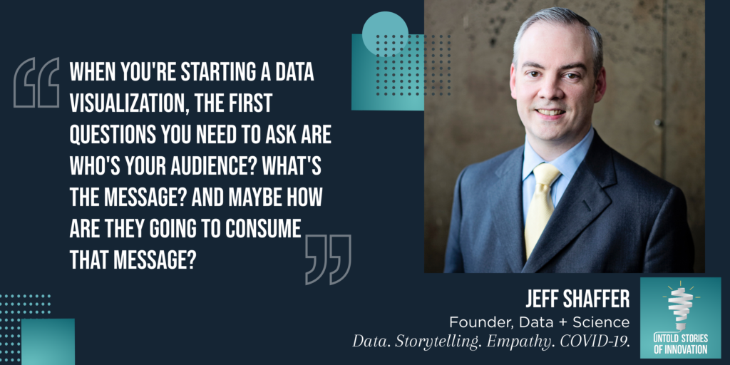
Jeff [00:08:26] I think that’s great, and it was another just fascinating intersection between your work and the work I’ve done, both as a professor or consulting and workshops. I always tell my students, you know, when you’re starting a data visualization in general, the first questions you need to ask are who’s your audience and what’s the message. And your point is right there. You know, who’s the audience? I thought lately, you know, there’s a third element that kind of relates to the audiences. How are they going to consume it? So you have you know, who’s your audience? What’s the message? And maybe how are they going to consume that message?
Katie [00:08:59] Yeah. What’s the medium?
Jeff [00:09:01] But I think that hits right on your points. And that’s why I loved your persona mapping so well, because it really gets down to when you talk about who’s the audience, are we—use our healthcare example, are we talking about doctors? Are we talking about staff? Are we talking about patients? Are we talking about outside people or internal people? And all of those things kind of played. And, you know, some of those are really interesting when you’re talking about. What’s the message that you’re trying to get out? You know, somebody from a and—you know, in our current environment, with the covid outbreak here, it’s kind of interesting. We’re talking about healthcare. But, you know, from a doctor standpoint, they might want to look at things on an aggregate basis and look at statistics. But at the end of the day, we’re talking about people, right? We’re talking about patients. And being able to see that. And a patient certainly wants to know a different piece of information, as, you know, what about me? So I think just nailing down that audience, the persona. Who are those people? What information do they need? When do they need it? How are they going to get it? That really drives everything else, whether it. Are we talking about an interactive visualization that’s going to live on a website? Or are we talking about an infographic that you’re gonna hand out in a pamphlet? Or is this a PDF that needs to be emailed out to the staff? You know, every day or every week. And so those are very, very important questions.
Katie [00:10:25] Let’s share some of our favorite data stories or data visualizations. You go first, because I feel like you are a library of knowledge when it comes to really effective and interesting ways to bring data to life.
Jeff [00:10:41] Oh, wow. I have so many favorites out there. So it’s even hard to pick and so many different genres, I’ll say, in the data visualization world. Some of the designers that I love, you know, from a data viz infographic and data viz design standpoint would be Georgia Lupi. She ran a firm called Accurate for a long time. She’s moved on to a graphic design company. But I love her work and what she’s done. There’s another graphic designer that came from the graphic design world, Nicholas Felton, and he created 10 years of the Feltron report. And these go back a few years now. He stopped doing those. A number of years ago. But I just—I love their work and I still use that as inspiration in the work that I do. I follow a lot of people in the Tableau community, you know, being one of the Tableau Zen masters and tableau being my tool of choice. I follow a lot of people in the Tableau community. So there’s countless people in the Tableau community, many of them, you know, good friends of mine. So I look to that for examples as well. And you know, having written the big book of dashboards, I always gravitate to great examples that people have out there, real-world dashboards. A good friend of mine, Chris Love, has a website called Everyday Dashboards. And I find that one fascinating because it’s people who have taken dashboards that they use at work every day and either anonymized it or turned it into a way that they could share it. But you get to see, you know, not work necessarily. That’s polished by The New York Times for the front page of the newspaper. It’s everyday stuff that people use to get the job done. And so I often gravitate to those kind of things as well.
Katie [00:12:39] Can you share with us some of the current projects that you’re working on or that you’ve worked on recently?
Jeff [00:12:45] The most interesting project that I’ve worked on this year was with an organization called Splash there out of San Francisco. It’s a nonprofit that helps bring water, clean water, to the various countries of the world, specifically right now working on large projects in Calcutta, in India and Ethiopia. And so through the Tableau Foundation, myself and one of the other Tableau Zen masters, Kristie Martini, he and I built a phase one for them that went live a couple of weeks ago. We built out a dashboard with some maps on it and it was interactive. They wanted a satellite feature to be able to see the maps in a satellite way. Then they had some other key outputs that they wanted to track and so we built an output dashboard. So that was a lot of fun. I have heard that they were traveling, before they before the outbreak of the Coronavirus, but they were traveling a lot out for funders and donors and project managers in the various countries. And it was exciting to hear how that how that dashboard project developed. So that was exciting. That’s probably my most recent project that I have had going on.
Katie [00:14:05] Perfect. So I’ll share a link if you can share it publicly. I’ll put it in the show notes.
Jeff [00:14:10] Absolutely.
Katie [00:14:11] Another couple of examples, and I have to give you credit, Jeff, for sharing these with me. But Alberto Lucas’ Lopez worked with National Geographic and they were reporting on malnutrition in children. And I’ll also link this in the show notes so you can get the visual. This is hard to do. It’s hard to talk about data storytelling in a podcast format. But essentially inside of this article in National Geographic, you have to physically cut out a ruler that’s sort of built into the page and then you can loop that ruler to create a circle and you see actual mid upper arm circumference measurements from children in malnourished communities. And so you—it’s this really powerful example of trying to help elicit empathy and really be able to tactically feel how small their upper arms conferences are in areas where children face malnutrition. That’s a really powerful one. You shared that with me, Jeff.
Jeff [00:15:19] Yeah, that was, I think, that was last year and just a great example of making it personal. That’s another thing in some of my teaching and workshops I’ve done is, you know, if you want to get engagement on your visualizations, you know, making it personal. And so you think about one of my favorite examples is my coauthor, Steve Wexler. He has a visualization on the age of people in the United States. And if you just showed a visualization of sort of the distribution of age in the United States, you might look at it and say, OK, you know, so what? Maybe there’s this interesting thing that you might see in the data. But what he does instead using some other techniques that others in the news organizations are great at doing this. But you make it personal and say enter your age. And when you put your age in there, you know, this visualization recalculates to show you how much of the population is older than you. Based on being a male who is 40 or 50 or if you’re a female and how many are younger. And so you kind of get a sense for where you are. And so I think that particular visit you’re talking about really makes it personal because it takes something that you don’t really see. You don’t really have a way of grasping it visually or mentally. How bad is it? And yet you tear this thing off and put it on your wrist and it’s you. And then all of a sudden, it’s wow, you know, it’s just kind of hits you. And so I think that’s sort of the ultimate in sort of making it personal, hitting the message home, right?
Katie [00:16:56] Yeah, absolutely. And one research study that you and I think are both fascinated by, it was conducted by NYU School of Engineering and Law. [2.5s] And together, they tried to understand whether making the data visual itself look and feel more relatable or more personalized or individualized, whether that would have an impact on the empathy of the viewer. And so, for instance, instead of having just a dot in the data visual to represent a person, they might have an icon of a human, like a visual that looked more like a person or even more specific. They might put a name to that person and they tried all of these different sort of experiments with that to show more generic or more personalized. And whether that would have an impact on the viewer’s level of empathy as they looked at that data. And the really interesting finding from that study was that making the data visual itself didn’t seem to have an impact on empathy. But the story or the text surrounding the data visual did. So, if the text went into more detail about the personal stories of the people who were being represented in the data visual next to it, that elicited more empathy. [25.2s] And they admit that this was a small study design and that it probably needs to be done on a broader context. But what are your thoughts on that finding?
Jeff [00:18:24] That was fascinating to me. And this might be something to link to as well in your shoe notes.
Katie [00:18:28] Yeah, I’ll link to that.
Jeff [00:18:31] I’m not surprised by that. You know, thinking about how effective is, you know, you see in infographics, you see little, little people often representing a bar chart or, you know, isotypes in some form. And I’ve always wondered that, you know, is a dot just as good. And I think that study kind of leads that might be correct. So I think that’s fascinating. There’s lots of other studies. You know, things about where you put things on a page, you know, and so your headline, whether you’re creating a dashboard or a visualization or just a PowerPoint slide, your top left corner of your of your biz is where everybody is going to look, you know, at first. Right. And so what you’re talking about, that text, having a—thinking about what the title is, having a descriptive subtitle, having good annotation layers and having them in the right place, organized on the page can make all the difference in the world to something like that. In our dashboard workshops, we talk about, you know, your key performance indicators or bands, as we often call them. You know, these big numbers, you put them across the top of your visualization because that’s where people are going to look. And it’s sort of the headline, right? It’s the headline of the story. And then you kind of get down into the details underneath it. Now, one thing I will say is, you know, this study didn’t compare this, but I think there’s something to be said for when we’re aggregating data versus disaggregating that data. I think that if we ran that study and said, OK, here’s bar charts showing the average lifespan of somebody who has the Coronavirus, you know, or the death rate or something, that’s going to be a lot less personal than if I had dots, you know, for every one of those people. And so I think that’s maybe something to be said is maybe being careful about, you know, aggregating up, losing that personal touch of it, that, you know, there may be something to showing one hundred dots on a page from my hundred patients. And this is you and this is where everybody else is versus just saying, oh, here’s the average where the one hundred patients are and here’s where you are. So I think, you know, it kind of goes both ways. But I think there’s some interesting things about that study and hopefully they’ll be future studies in that area.
Katie [00:20:53] We do drive really deep into some of the more complex challenges surrounding data storytelling, everything from eliciting empathy to having an ethical stance around, you know, thinking ethically about how you’re visualizing data. Let’s actually step backwards a little bit and talk about some of the basics, because what I love about working with you on this workshop and in other projects is that you have really refined and sort of created patterns that you see of the different types of data visualizations and the impact that they have on the viewer. One of the things that I think maybe some listeners will be surprised about that I was surprised to learn is that we should try to always avoid the pie chart.
Jeff [00:21:37] You know, that particular chart type, pie charts and donut charts, get a lot of bad press in the data visualization community. And people often associate it with just charts. You know, many of my colleagues in the field, you know, we’ll just say just don’t use them. And you know that advice is probably good advice. I think it’s a little more nuanced than that always—no matter whether, you know, whatever the data viz chart is, it kind of goes back to the fundamental building blocks in data viz we call them the pre-attentive attributes. And just human beings are really good at some things and just not good at other things. And so really what you’re, I think, what the question leads to is really what are humans good at and can we leverage the things that humans are good at to get to the information quickly and accurately. And in most of the data viz research that’s out there. The foundational research really measures those two things. That’s what all the research has really been based on. More recently, we’ve studied other things like memory of a viz or things like that. But, you know, really at the heart of it, are we getting the information quickly and accurately? And so as an example or the example you used. We are generally better. We are better as humans. And this has been studied with looking at things like position. We’re very, very good at the position of objects in space. We’re very, very good at looking at the length or width of something. But we really fail miserably when it comes to estimating the size of something or the angle of something or the arc of something or even color, you know, trying to figure out how much more blue is that. You know, is it twice as much blue or is it three times as much blue? That’s gonna be a very, very difficult task, you know, to do. And so it’s really a learning, I guess, the basics of data visualization more than just the chart types, but just sort of the fundamental, you know, way our brain interprets this information and does it quickly and then leveraging those things to get the right things on a page. You know, I think one of the things that you probably picked up on from a lot of those slides is simplicity, really. I mean, even if I take a, you know, the evil pie chart, I can make a pie chart, you know, useable by just reducing its complexity. So instead of having 18 slices, maybe I only have two or, you know, just show one number. Eighty five percent or something like that. And so really, no matter what chart type you pick, if I say bar charts or stack bar charts or line charts, if I add 50 colors to it and add a thousand labels, it’s gonna become incomprehensible and we’re gonna overload the reader and they’re not gonna get the message no matter what chart type I use. Right. So it’s kind of a combination of these things that you kind of learn and put together.
Katie [00:24:38] Now tell us the process of taking data visualizations and moving them into dashboards where we’re looking at multiple data sets or data points. Can you tell us some best practices that we should have in mind as we migrate and work to build a larger story with the data?
Jeff [00:24:56] Yeah. Boy, that’s a great one, because that’s—I think that’s what many organizations are challenged with every day. So, you know, I’m going to start at the beginning, which is your data. How good is your data? So, you know, you’re going to have to sit down and figure that out. So you need to figure out what is it—what are the key things that you’re trying to measure in your organization? What are those what are those key performance indicators? Do we know them and what do we want to track? And then once you once you have that, you’ve got to start with the data, because you may not even have the data to track the things that you need to track. Right. And so it starts with the data having, you know, some semblance of data, governance, data gathering, knowing where it is, what’s the source of it, how good is it? Can we trust it? Right. There’s the sort of the veracity of the data, if you will. And then, you know, once you have that, then you can kind of put those things together. You know, I find many organizations—well, I’ll use the healthcare example again that you and I collaborated on. They had data coming in from, you know, a dozen different sources. And so, you know that that adds to the complexity of it. Where does it come from? How good is it? Can we trust it? How often is it updated? There’s—data is always messy, you know, especially if there’s free-form responses in the data and things like that. So that that’s really the starting point for me. We have to figure out what we’re trying to measure, what we’re trying to improve, what we’re trying to monitor. And then, you know, we go to the data and see if we can put that together. Then the next step is, you know, sort of the design of that thinking about, OK, well, we want to measure what? Do we want to measure our actuals versus a target? Do we want to see something over time? Do we want to see the location of people? And that’s going to drive what visualizations we choose, whether we’re using a bar chart or the target line or whether we’re plotting people on a map. That’s going to be the tool that we use to answer the questions that we asked in the first part. And then putting it all together on the dashboard, you know, as nuanced. And, you know, we wrote a book about it. You know, that part is almost the easy part after you—if you’ve done the first two parts correctly, getting it together in the final step is almost the easy part. Right. You know, putting it together in a way—in a simplistic sort of simple as can be with as much detail as necessary in a way that people can see it and use it.
Katie [00:27:26] What should we be anticipating when it comes to the future of data storytelling? I’m thinking specifically about artificial intelligence, big data and the, you know, increasing ability for technology to interpret and analyze data to some degree?
Jeff [00:27:44] I think it’s great. And I think it’s horrifying. You know, both in one. You know, the great part is the tools are getting so much better. They’re getting—the way—and I’ll speak to what I know best would be Tableau. You know, they’re doing quarterly releases and the features that they’re adding at such fast pace. It’s just amazing that they’re just, you know, quarter after quarter, they’re just adding these features in there. One of the ones that they focused on last year was what they call ask data, where you have an artificial intelligence engine that sort of figures out behind the scenes what query you’re asking when you say how much were sales last month. And then you say. And how about Ohio? You know, it doesn’t start your query over, it says, oh, you want to know how many sales you know in the US. And then when you asked in Ohio, it’s sub queries that goes down to Ohio. I think that’s brilliant. You know, it’s a great tool. Where I think it’s horrifying is we have to be really, really careful. Again, it goes back to our data. Do you understand the data that you brought in? You know. Did you already aggregate the data before it was brought in or maybe it was not aggregated? So when you start asking questions, you better be really careful about what that data was that you brought in, because, you know, you’re going to ask a question, it’s gonna give you an answer and you’re going to—if you treat that as gospel, you could get yourself into a lot of trouble. So I can just think of, you know, instances where, you know, you’ll bring in data of, you know, ten years over time of, say, health care data, you know, child mortality data or something. And you ask a question, well, did it some that up for you or did it average it for you? And did it average it how? And over what period of time? And those are all things that at least today and in the near future, we need to be in control of. Right. We need to understand how it’s doing that and not just letting the A.I. take over the answer for us and trusting it.
Katie [00:29:43] Yes. It’s an incredible responsibility that we’re putting into our technologies and to the degree that we can keep making sure that from an ethical perspective, those algorithms are accurate and that we are still bringing humans in to ensure their accuracy and ensure that the interpretations are correct. I don’t know that we’ll ever get to a point where humans are not playing a role in that process. At least I hope perhaps that we don’t get to that point.
Jeff [00:30:18] Yeah. Part of it may be just, I think, where we are on the curve. Right. Everybody’s talking about artificial intelligence, machine learning specifically. And people are realizing that, you know, to do that, we have to be, you know, we have to be doing that to stay ahead. And that’s all great. It’s just I guess putting the critical thinking to our data’s is not something that we can give up at this point. And so I think as you talked about, you know, in the data storytelling, I just wouldn’t want to rely on, you know, a computer in the near future giving me that story. I want to apply the human element of cognition, you know, to be able to interpret those results and then ultimately come up with that story. And maybe that’ll change 20 years from now. But I think where we are today, you know, that’s one of the fears I have.
Katie [00:31:09] You know, getting back to that idea of empathy. I think that’s part of the reason why that fear is so real. One of the studies in the technical writing world that I come from, a professional writing researcher, went into the military and observed their practices around analyzing data when it comes to making decisions about aerial attacks. And sometimes that data was more personalized and sometimes that data was less personalized. Meaning there were certain code words or ways that they sort of use rhetoric, rhetorical choices, to remove the individuality of those communities from that data. And the finding was that when that individuality was further removed from the data and the language that they were speaking around those aerial attack decisions, those attacks were more frequent. They were done with less critical thinking, as you said. And I’ll link to that research as well, because I think it’s a powerful example of remembering why we should always be mindful of the stories we’re telling ourselves from the data. And if the language choices that we’re making as we analyze that data are working to distance ourselves from the impacts of that information, I think we should—we need to be especially mindful of how that perhaps enables certain actions or speeds up certain actions or removes empathy from those moments.
Jeff [00:32:50] And we are living a moment right now where that is absolutely true with the way the Coronavirus is spreading around the world and data coming from various places. John Hopkins has a centralized database that a group of people at Tableau tapped into and made available to everybody the amount, I think yesterday. Or I think it was yesterday. There’s a thread on—a Reddit subthread—called Information is Beautiful. And it was the first day that the majority of visualizations on that thread. We’re based on the Coronavirus. 52 percent or something of the visualizations that were being posted out there had to do with that. And that’s something I think, you know, you hit right on there is we just have to be really careful about that. You know, I could show numbers of say, you know, the Corona virus and say, oh, well, the death rate is only. And, you know, put in your percent, 2 percent, 1 percent, less than a percent, whatever. But it’s much more detailed. Right. If you dive in and kind of filter that down and see, oh, if you’re over a certain age, you know, the death rate is 15 percent. And so it’s easy to, you know, throw this off and throw out data and just say, OK, well, it’s not so bad. It’s just like the flu or it’s not spreading as quick. And you’re inferring data or you’re aggregating data in a way where you lose that empathy that you’re talking about. You think about, OK, well, if I’m 75 or 80 years old, I may not feel that way. And so, you know, for somebody my age to say, oh, I’m not really worried about it because it’s, you know, 0.5 percent chance of dying, that kind of disconnects us from sort of the rest of humanity there, doesn’t it? And so visualizing that in ways I’ve seen a lot of discussion in the last week where people have just, myself included, just have taken the route of, you know what? We’re just not going to visualize that data because we just don’t know enough about it at this point to be confident in what we’re producing. And I think that goes to the opposite of empathy. Right. We could actually do harm in some situations.
Katie [00:35:00] Yeah. It’s incredible, especially as more data is publicly available and more tools like Power Behind Tableau are accessible. We have to start questioning then the legitimacy of those visualizations and making sure that we’re analyzing. Is this coming from a credible source or not? Because like you mentioned, those publicly available data visualizations, now 50 percent of them are, you know, on Coronavirus. And so are there ways, are there strategies that you would recommend to the public in terms of understanding or being able to assess whether a visualization is credible?
Jeff [00:35:39] Well, yes. So, I mean, two things. One, if I’m the visualizer, I have to ask myself and this is what I’ve done personally, do I need to visualize it? You know, I will tell you, I’ve downloaded the data. I’ve connected to the data, connected to the data prior to the work that the Tableau group did. And I even connected to their data. And I’ve made some visualizations. But I decided not to publish any of that. I just wanted to know myself and look at the data myself and see what was going on for the vizes that are out there. When I read them, I just have to look at it with a healthy bit of skepticism. Right. They’re visualizing this information. I’m not saying that they’re all bad by any means. It’s just you have to understand the context in which the data was gathered, for example, to compare it to the flu. Well the flu’s been around for a very, very long time. And we have a long, long history of data on that. This this this Coronavirus is brand new. So to make an A-B comparison there makes it really, really difficult because we don’t know yet. Right. To make any kind of comparison to what’s going on in China. You know, that’s different conditions, different health conditions, different amount of people and a different amount of space in different environments under different government control. We can’t take the data that we have there and superimpose it on the United States and say it’s going to travel as faster or slower or even the same. So just things that we just have to kind of be careful of is I guess this applies to any data, really, but especially in this data is using it in a way that we’re making assumptions of the data. Right.
Katie [00:37:14] Absolutely. That’s right. Yeah. And even on NPR and my drive here to the recording studio, they were talking about this fine balance that that the medical community is trying to get. You know, that the public, we really need to strike, which is between knowing where the virus is at any given moment and how rapidly it’s spreading and balancing that with the fact that going in to get tested puts more of the public at risk. And so trying to kind of I think at this point, the advice is sort of if you’re having symptoms, try to isolate yourself. And if you—if those symptoms accelerate or get much worse, then go see a medical provider. So maybe don’t jump to even getting tested right away because that’s going to put other people at risk. Right. Of exposure. So it’s such a strange time that we’re living in right now. And I’m really grateful that we’ve been able to think together about how data storytelling and data visualization is part of that conversation.
Jeff [00:38:17] Yes. Especially with the empathy part that you often talk about. I think that’s just right on.
Katie [00:38:24] Jeff, thank you so much for being on the podcast. I love working with you. I love that you have this incredible site. If you—I recommend everyone go check out dataplusscience.com. It is an incredible resource where Jeff breaks down different visualization strategies. And together we’re thinking more about storytelling. We hope to have more content out there together in the future on that topic. But thank you so much, Jeff, for being here.
Jeff [00:38:49] Thank you. Thanks for having me.
Katie [00:38:52] Jeff, if people want to find you on social media, where can they find you?
Jeff [00:38:56] I’m very active on Twitter. My Twitter handle is high viz v-i-z ability and also on—I’m around. Easy to find. Connect up on LinkedIn or Facebook. I have a data plus science page, connect up on data plus science.com. So yeah, kind of all over the social media.
Katie [00:39:20] Wonderful. Thanks so much, Jeff. Talk to you soon.
Jeff [00:39:23] Thank you.
Katie [00:39:25] Thanks for listening to this week’s episode. Be sure to follow us on social media and add your voice to the conversation. You can find us at Untold Content.
You can listen to more episodes of Untold Stories of Innovation Podcast.
*Interviews are not endorsements of individuals or businesses.